Reenie P - Letting The Material Speak For Itself
Page 3
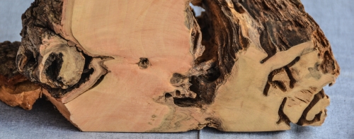
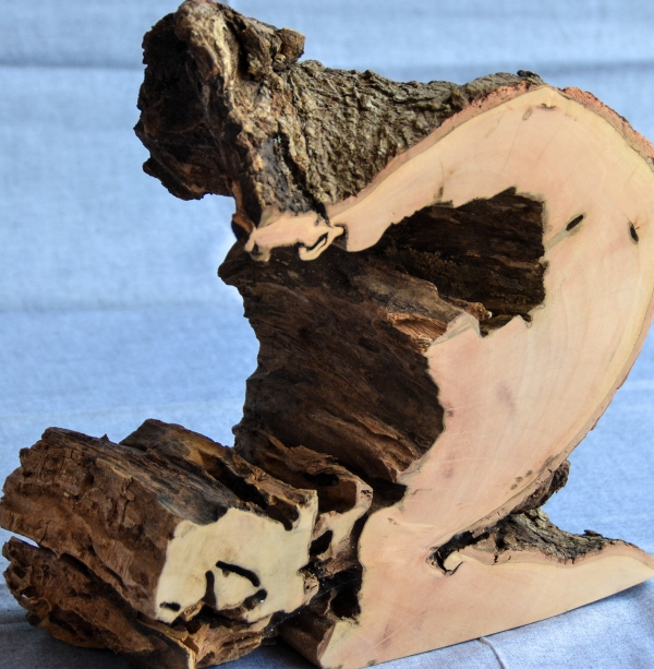
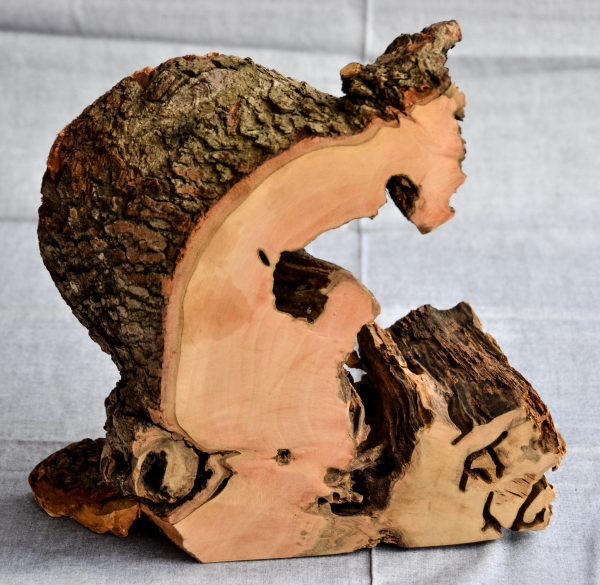
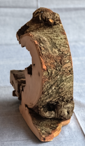
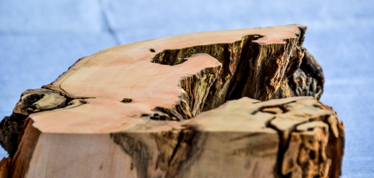
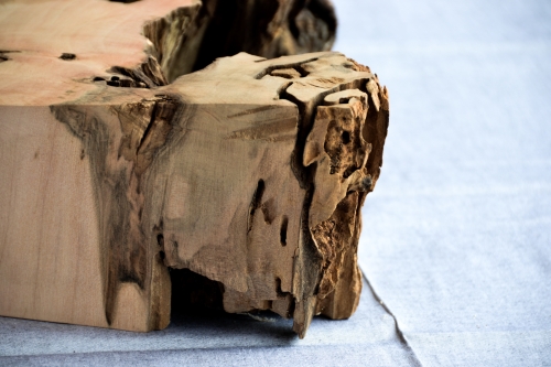
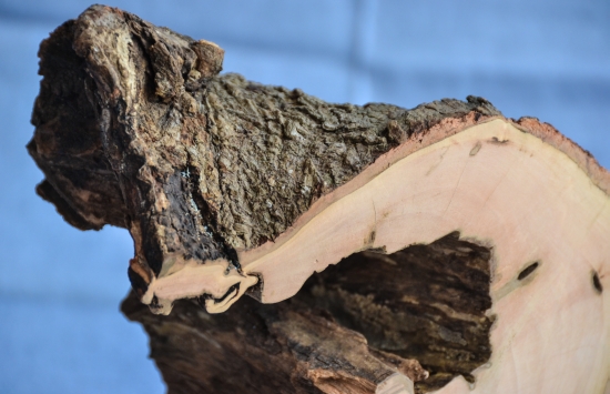
None of Reenie's work has any kind of name or other label that you can hang on it. She does not sign them. Each piece just is and that's it. Reenie has stripped away all extraneous encumbrances, and drilled all the way down to the bare essence of things in no uncertain terms. I like that.
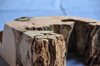
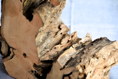
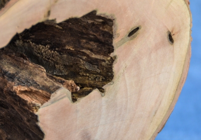
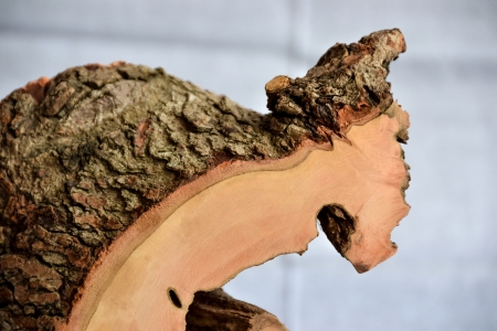
A note on colors, if you please. The cloth behind all of the objects in this photo essay is the same, despite appearing more or less, gray or blue, in any given image. Between the camera seeking auto white balance, the color of the object itself affecting things, the angle and quality of the lighting (indirect natural light with an ever-shifting balance of blue sky and white cloud was used throughout, no artificial lighting ever) for any given frame, and my own tastes in post-processing, colors are going to shift around a little. While we're at it here, I may as well also mention that whatever monitor you view this with will also have a noticeable impact on percieved color. Just keep in mind that it's perceived color, and don't worry about it, ok? When you take one of these home, the same sort of thing is going to happen, depending on the color of your drapes, the lighting that's hitting it, and any number of other imponderables. Your eyes will take care of everything, so don't sweat it, ok?
